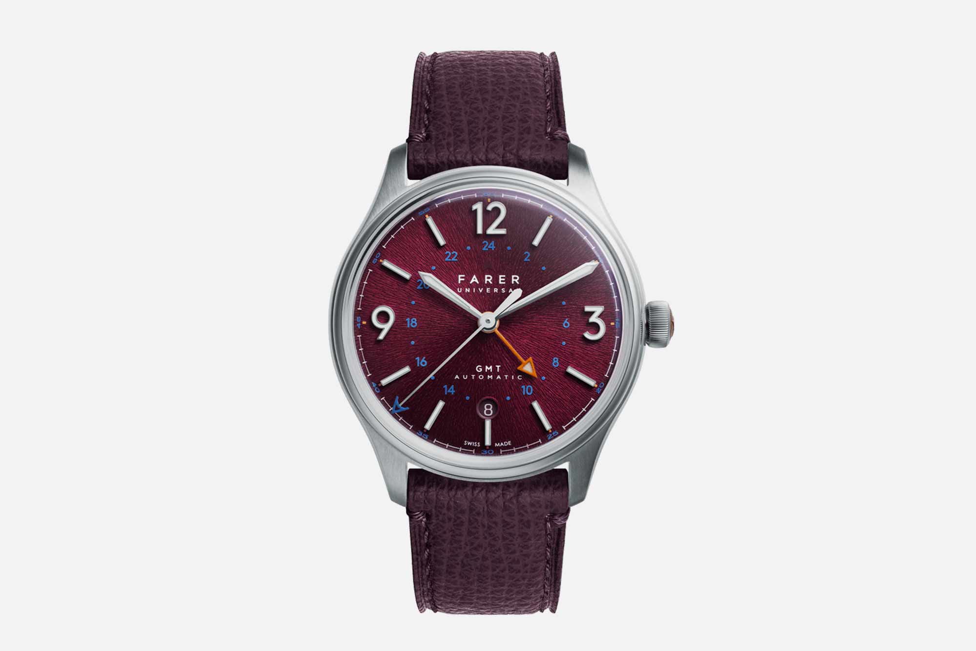
We’ve been covering Farer for a long time on Worn & Wound. To say they are a core brand in our little enthusiast corner of the watch world would be an understatement, and it’s been exciting to see them grow, experiment, and further develop their own unique design language. For as long as I’ve been covering the brand, it’s been the colors that have stood out. They have just always had a knack for picking interesting and unusual color combinations. And their typical release strategy underscores that point – they’ll frequently release a handful of watches in the same style at one time, each adopting different color palettes, and thus emphasizing the impact those decisions have on the finished product. Their latest release, the Banzare GMT, is not part of a multi-watch drop, but it does feature a striking new dial texture for the brand in a color that some die hard Farer fans are sure to appreciate.
The GMT has become a signature complication for Farer, probably because it gives the brand a chance to explore colors and contrasts in natural ways. Think of the different elements of the dial that need to be navigated here: the dial itself, the main hour markers, the time telling hands, the GMT hand, the GMT hour scale, the date, the minute track, and we haven’t even gotten to the various wordmarks yet. There’s a real challenge in making sure all of those elements play well together, and it’s something Farer has always excelled at.
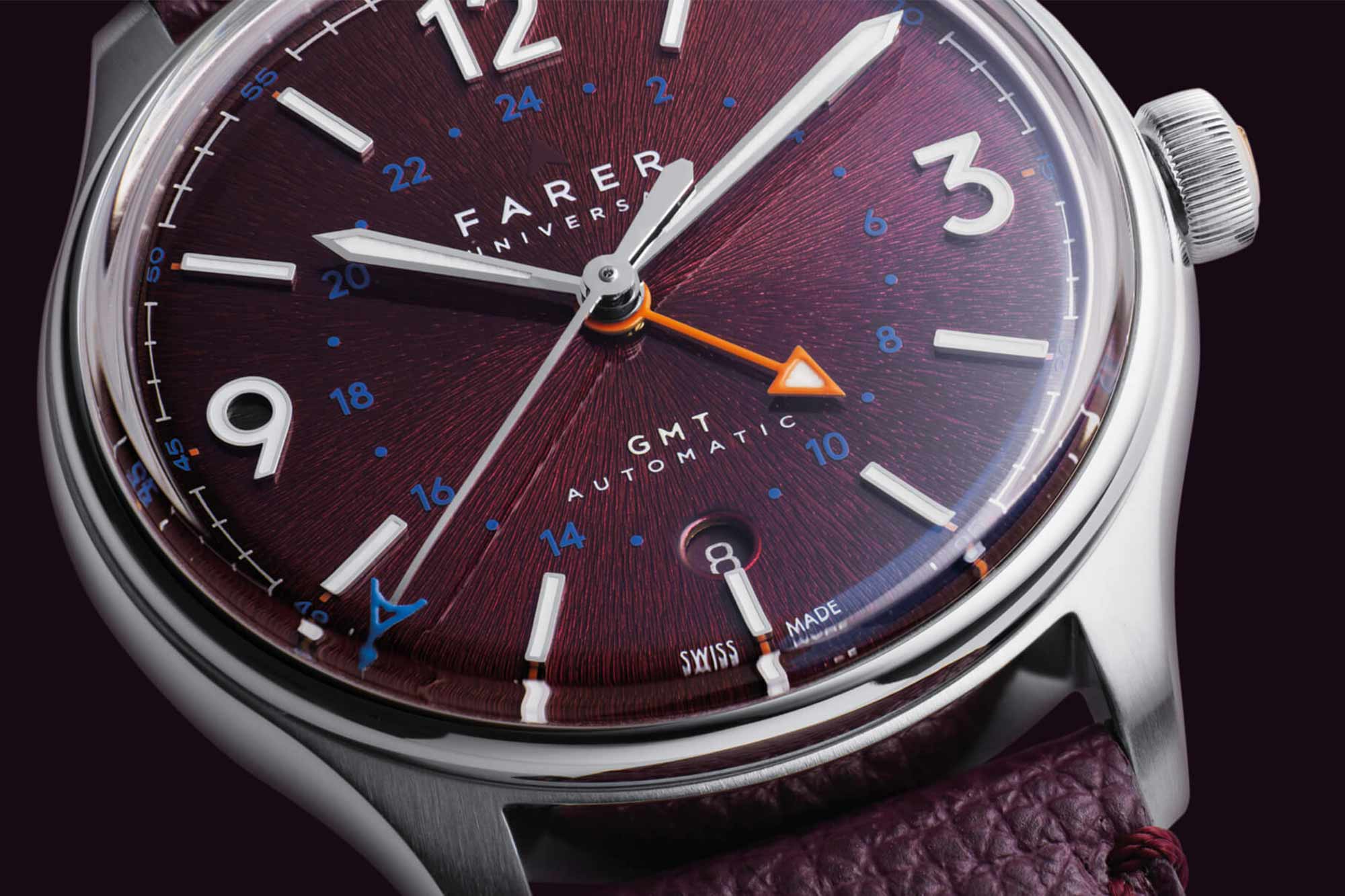
The Banzare gets a plum colored dial that Farer says shifts to a “metallic mulberry” in the light. It’s reminiscent of some of Farer’s other more adventurous red and red-adjacent dials (I immediately thought of the Crooms I reviewed back in 2020), but the real story here is the texture. Farer describes it as a “deep-ridged sunburst texture in relief,” and it’s been given a transparent lacquer finish.
Let’s address the elephant in the room, something observant watch fans have likely already clocked: this looks an awful lot like Grand Seiko’s signature “Mt. Iwate” dial texture, at least in the Farer supplied images. To Farer’s credit, some Instagram commenters have said as much, and the brand has received the comparisons gracefully. My feelings here are mixed. I’ll say up front that I haven’t seen the Banzare in person, so it’s hard for me to evaluate it in a meaningful way. But I’ll say that one of the things I’ve always enjoyed about Farer is that they seemed to have always truly done their own thing. There have been little homages to watches that have inspired the brand here and there, but this feels a little different because the Mt. Iwate texture is so recognizable and important in Grand Seiko’s modern history.
Nevertheless, it’s hard to argue that the Banzare doesn’t have a certain aesthetic appeal, or that it isn’t a Farer through and through. As always, the color combinations are remarkably and unexpectedly coherent, with orange and blue accents matching up against the plum/mulberry fruit salad of a dial. Oversized Arabics at 12, 3, and 9 are lume filled, with batons elsewhere, and a 24 hour scale in blue in the dial’s interior section.
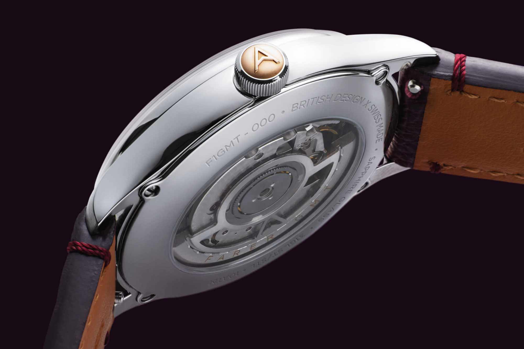
The Banzare case measures 39.5mm in diameter and is 10.8mm thick. It’s water resistant to 100 meters, and can be purchased on a leather strap or a three-link stainless steel bracelet (as an add-on). It’s powered by the workhorse Sellita SW330-2 caliber. The Banzare is also a limited edition – only 150 pieces will be made.
The retail price is $1,465. More information can be found here.


