If you had told me a few weeks ago that one of the brands I’d feel best about coming out of Watches & Wonders 2024 would be Raymond Weil, I’d probably have been pretty confused, because at that point I don’t think I even had a meeting set up with the brand, and their attendance at the show was not even on my radar. But Watches & Wonders, as ever, has surprises in store for everyone. And sometimes you wind up taking an unexpected appointment with a brand you frankly don’t really know much about or have paid much attention to over the years, and it completely wins you over. Raymond Weil, dollar for dollar and watch for watch, had one of the most impressive showings at this year’s Watches & Wonders, and they took me completely off guard.
Worn & Wound has covered Raymond Weil sporadically over the course of our website’s existence. CEO Elie Bernheim came on the podcast in 2017, and there have been a handful of new releases written about and reviews filed, but for the most part Raymond Weil has simply not appeared in these pages. Why is that? Well, for much of the brand’s history, they just haven’t caught the eye of the enthusiast. Raymond Weil has always positioned itself as a mass market brand making affordable watches for everyday people, not collectors or connoisseurs, necessarily. There’s nothing at all wrong with that, of course, it was just never really our wheelhouse.
View this post on Instagram
But the brand has been slowly and methodically repositioning itself, with last year’s surprise GPHG win for the Millesime catapulting the brand to the attention of collectors overnight. I saw the Millesime in the metal for the first time in Geneva last week and came away very impressed. The sector dial layout is about as classic as it gets, taking cues from vintage watches but in a contemporary 39.5mm case with ultra clean lines. The thing that really spoke to me about these watches was the excellent finishing on both the dial and case. The sector dial itself features multiple finishes to delineate the distinct quadrants and draw the eye where it needs to go. And the case feels absolutely great for a watch that comes in under $2,000. It’s razor thin (just a hair over 10mm) and wears great. There are, admittedly, many similarly styled watches on the market at comparable price points (particularly from Longines) but I’d say if you’re in the market for any of them, the Millesime is worth cross shopping.
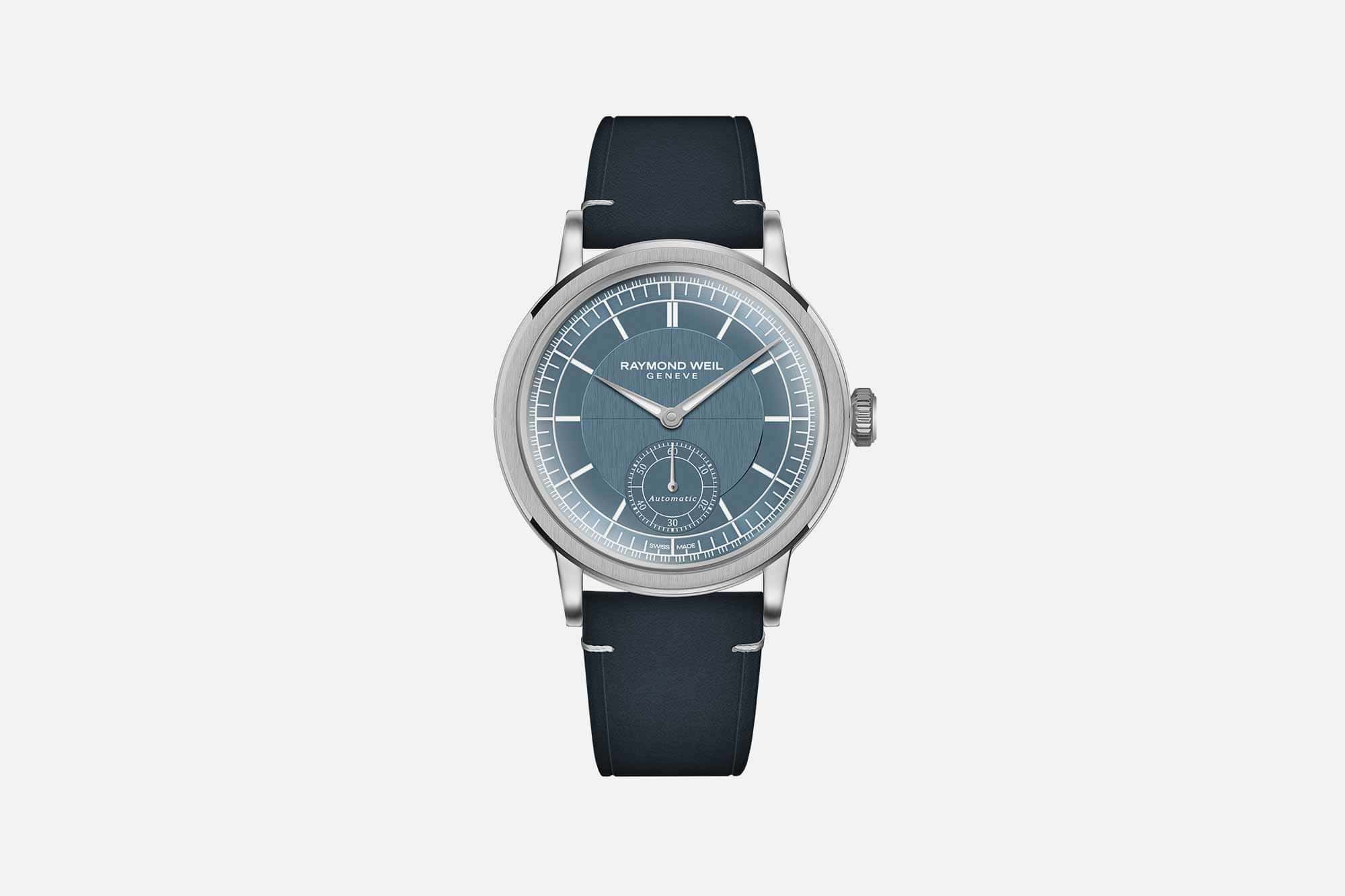
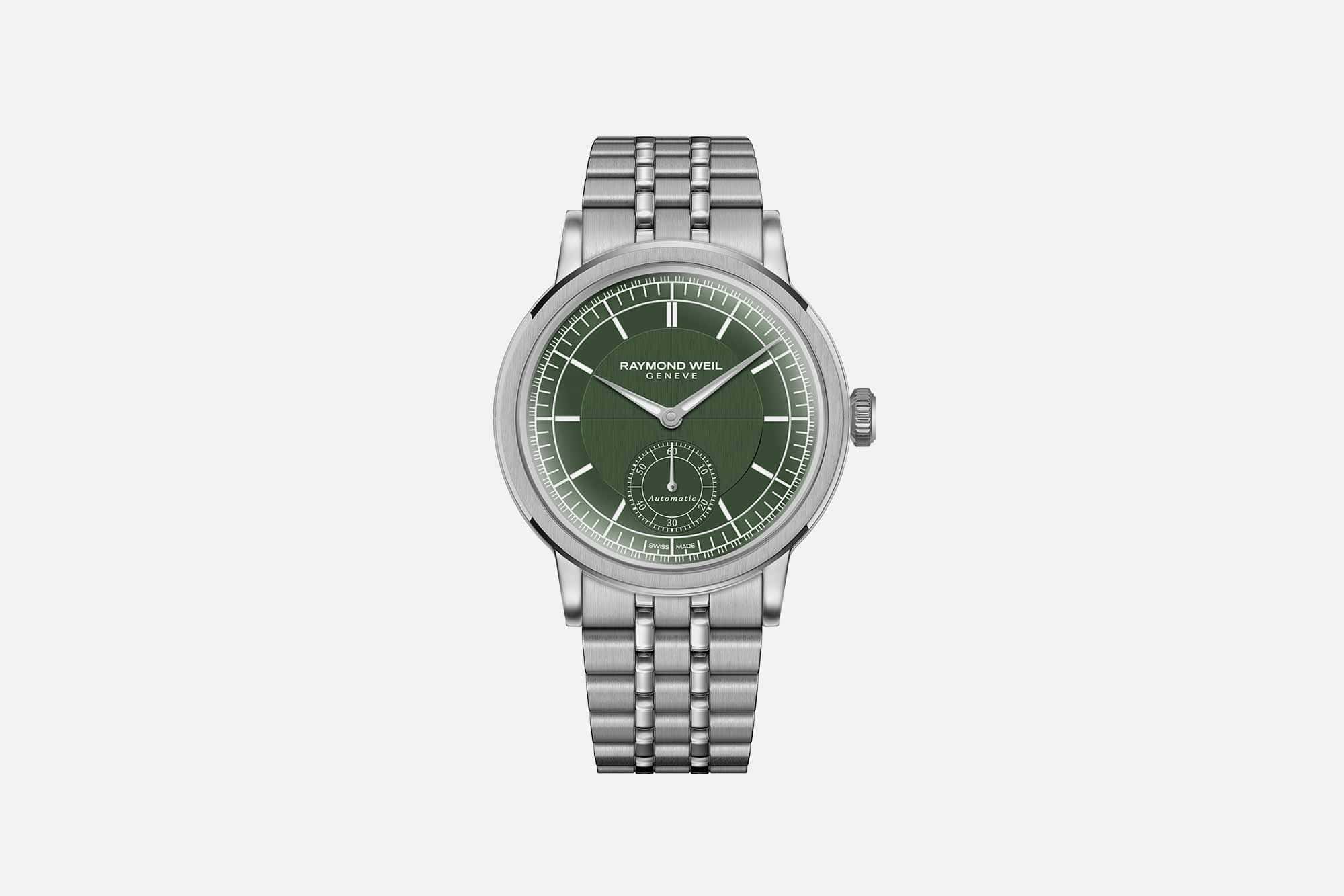
The new novelties presented at Watches & Wonders build on the success the Millesime experienced last year, significantly expanding the collection. The original version in the 39.5mm case with small seconds at 6:00 now comes in two additional colors: denim blue and British racing green. The green dial is matched to a five link bracelet while the blue comes on a leather strap. Otherwise, these references are identical to the original GPHG winner, and feature the same 50 meter water resistance, multi-finish dial, and Sellita based RW4251 automatic movement.
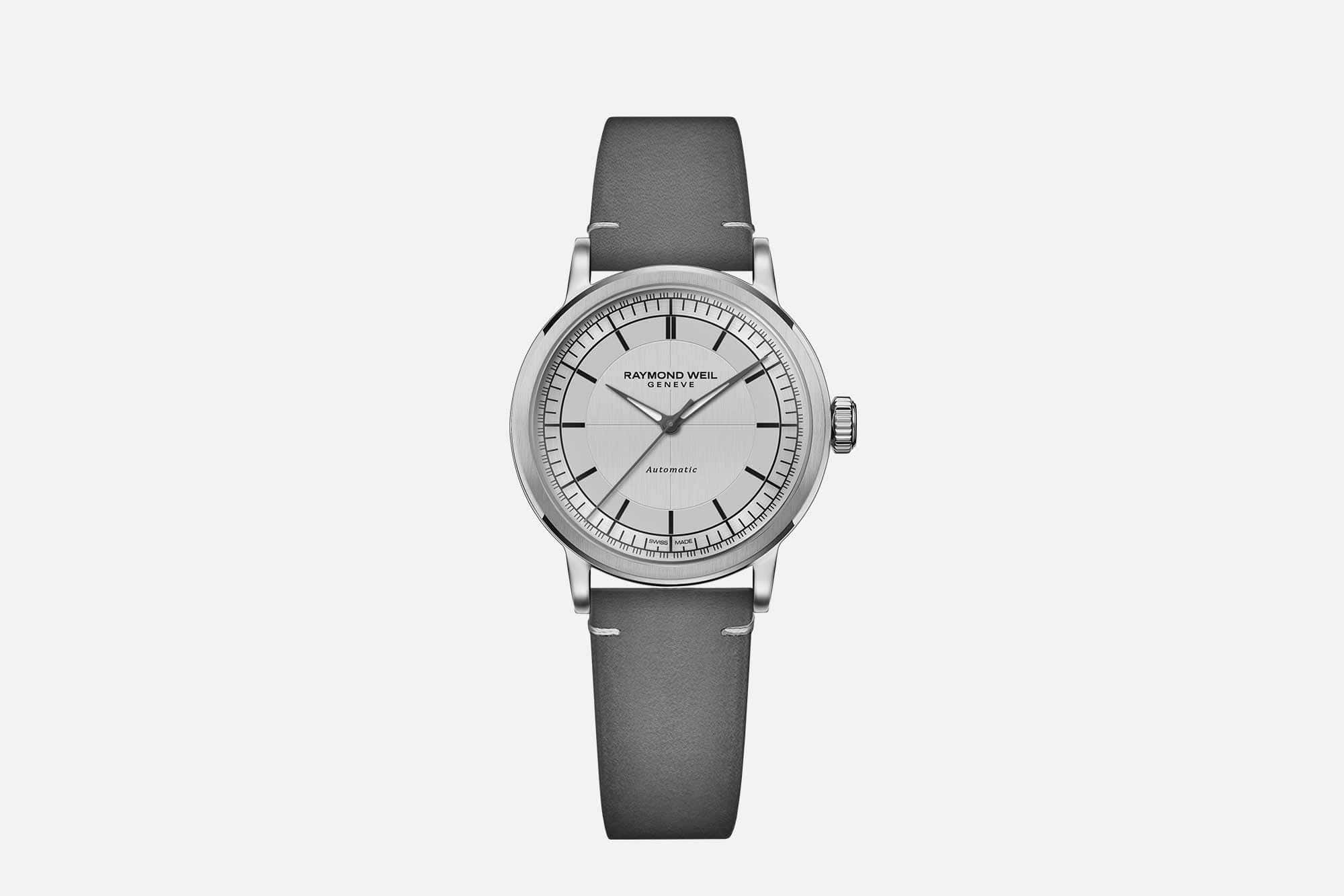
In addition, Raymond Weil has introduced a trio of 35mm versions of the Millesime with central seconds that they describe as unisex. Handling these watches, they give off strong vintage vibes. The size is right in that standard, generic, everyday watch of the 1950s neighborhood that can easily be worn by anyone. Dial options in this series include silver, denim blue, and burgundy.
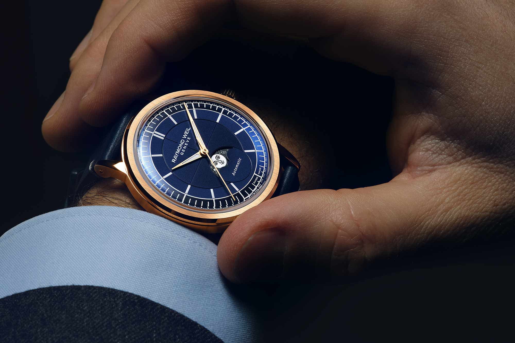
We also get a total of four new Millesimes with moonphase complications: two in a 35mm case (in denim blue and silver, the latter being gold plated, the former with lab grown diamonds set in the lugs) and two on the 39.5mm platform (silver and midnight blue, with the blue getting a gold treatment). These are very much in the same vein as the time only references, but offer an even stronger vintage throwback feel thanks to the complication itself and the specific way it’s executed, with a moon disc featuring a human face. This little detail makes the whole package just a little more whimsical, and in handling these watches briefly in my meeting I came to realize that the recent trend of using hyper accurate representations of the moon is a lot less interesting than this more artistic and traditional take.
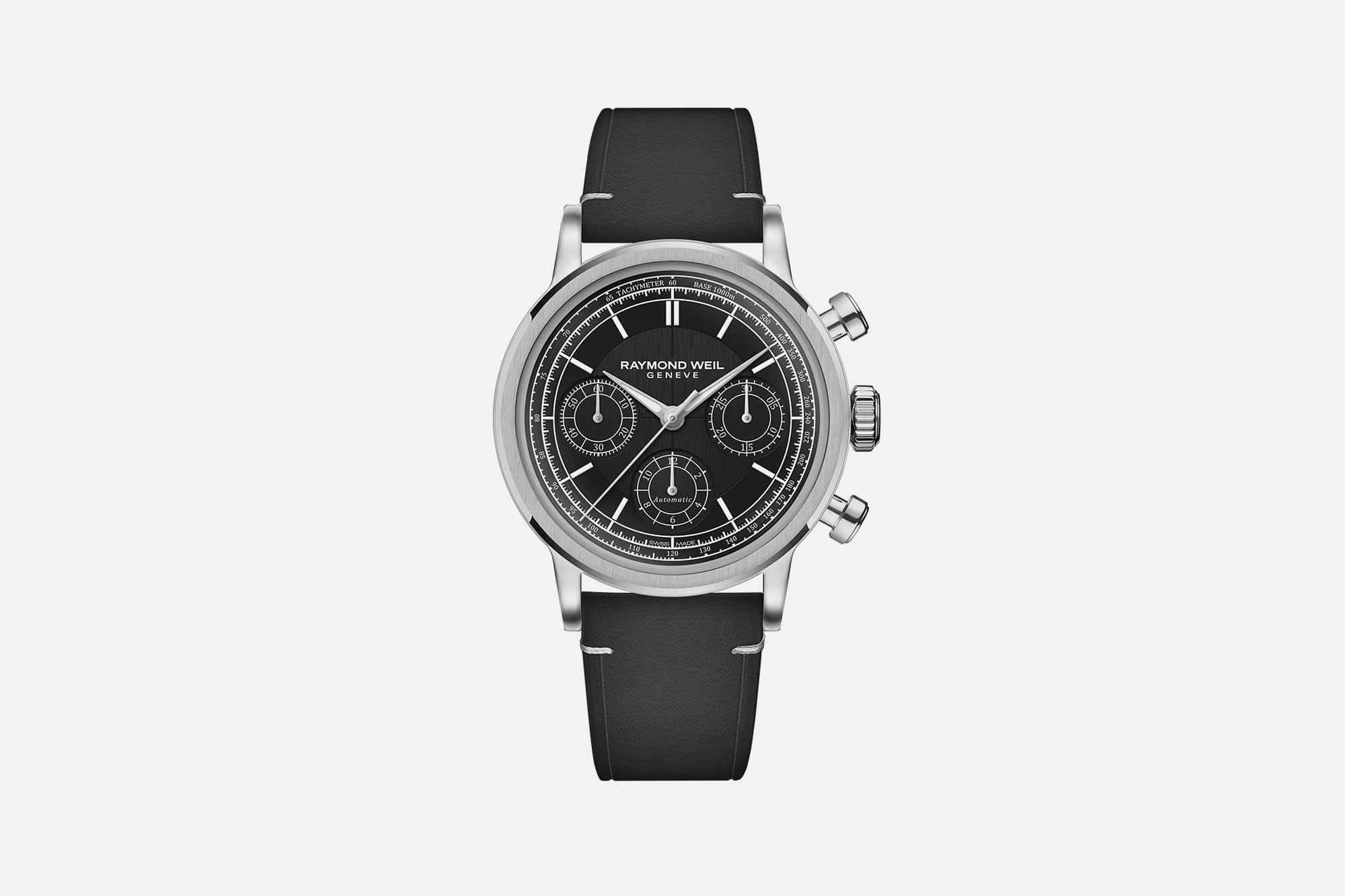
Last but not least, Raymond Weil introduced two new Millesime chronographs, one in black and the other in blue. They keep the 39.5mm case as the other larger Millesimes, but the addition of the chrono immediately makes them a whole lot sportier, thanks in large part to the oversized pump pushers. I’m a little less convinced by these watches, if I’m being honest. The time only and moonphase Millesimes have a simple charm to them and a refinement born out of that simplicity. The chronographs are handsome but the dial execution, to me, feels a bit like an afterthought, as if the brand realized they need a chronograph in this collection to appeal to a certain customer (they don’t, in my opinion).
Handling these watches during my relatively brief trip to the Raymond Weil booth got me thinking about the brands we cover versus the brands we don’t, why that is, and if it should change. The fact is, there are too many watch brands out there to cover all of them, so there will always need to be decisions made about what to feature here, and some simply won’t make it to the website. But it’s worth remembering that brands change and evolve over time, and Raymond Weil is a good example of a watch brand that was flatly not very relevant to our own audience for years, but now has watches that are very much worth paying attention to. Raymond Weil
