Last year, when Ressence announced the Type 8, it was met with great excitement and surprise by their fans, including yours truly. A simpler and less expensive Ressence wasn’t something that seemed on the horizon. The watch was a stripped-down take on the seemingly magical Ressence display, reduced to hours and minutes. A lack of numerals, matched with an expansive, heavily domed dial, gave the Type 8 a different mood from Ressence’s other watches. Rather than leaning toward the technical, they felt meditative, which is perhaps to say, they felt less about the engineering and more about the resulting experience. I shared my thoughts in a review you can read here.
A year and a half or so later, Ressence has dropped one of the biggest surprises of 2024: a follow-up to the Type 8, which is logically called the Type 9. This wasn’t at a big event like Geneva Watch Days or Watches and Wonders but rather a random week in December, making it even more unexpected. Adding to the shock, it’s another departure from the Ressence norm, featuring their most compact case, and yet continuing the simpler hours and minutes only dial. However, where the Type 8 felt like a radical change, the Type 9 feels more like a spin-off. It’s not a new story but a subplot or side quest. Perhaps, even an alternate take on the Type 8.
Case
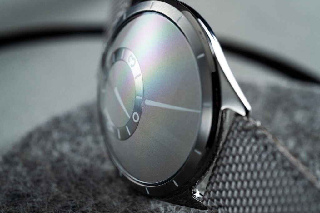
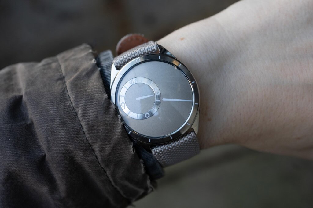
Typically, with Ressence, the dial is the star of the show, but for the Type 9, it’s the case. The dial is special, too, but it feels like a variation on the Type 8, not something completely new. Measuring 39mm x 42.5mm x 11mm, the elevator pitch is that it’s 2.5mm smaller in diameter than the brand’s next smallest case, the Type 12, which is a square, so it wears larger regardless. Additionally, the Type 9 is the first to feature an external minute index. This requires a wider and, frankly, more traditional bezel, which reduces dial real estate, visually compressing it. The result, plainly, is a lovely little Ressence.
But it’s not the size alone that makes the case appealing. Made from grade 5 titanium, it has smooth lines, giving it the feeling of a polished stone, which speaks to the ergonomic ethos behind some of their larger models like the Type 1 (the product page of which literally says “polished stone”). While being rounded unto itself is not unique, the specific geometry here is, as it has to incorporate Ressence’s signature domed dial. As such, the topside of the case is a continuous line from the bezel across the domed sapphire. The bezel kinks in ever so slightly before hitting a seam that transitions into the mid-case, which is fully polished and has a generous radius along the watch’s side. It then swoops below, connecting with the domed case back, which doubles as the crown.
Another uncommon feature of the Type 9 is the nearly-traditional lugs with 20mm span. They are small, but unlike the flared, hooded lugs of the Type 8, they should allow for more strap options. Further, straps with curved ends would fit well, and curved spring bars could allow for the use of pass-through straps. One of the unexpected joys of the Type 9 is running your fingers along it, feeling its flowing lines. You want just to hold it in the palm of your hand. This is not a great idea, however, unless you enjoy fingerprints.
From the original press photographs, I misinterpreted how the bezel was constructed. I imagined a dark gray brushed insert was set into the bezel to create the minutes index. In reality, there is no insert; rather, the bezel is brushed, engraved, and lume-filled. The result is lower in contrast than the press photos made it seem, though it doesn’t cause issues with legibility. If anything, it makes the case look more like a solid piece of titanium while giving it an athletic feel that makes it stand out in the brand’s catalog.
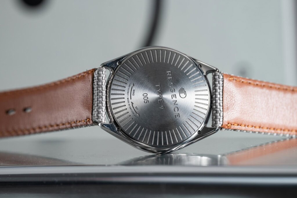
As with other Ressence models save the very first, there is no crown in the traditional sense; rather, the case back itself is used to set and even wind the watch. The greatest benefit is that the case has no protrusions, allowing it to be ambidextrous and emphasizing its lines. Furthermore, it makes the case look and feel just a touch smaller, especially when worn. The downside is that it’s more of a pain to set, especially if you have to cycle through many hours, and it seems to lead to a rather measly 1 ATM of water resistance, which Ressence refers to on their site as “splash resistant.” This belies the sportier look of the case, which is frustrating as it makes it less of a practical timepiece. Considering the five-figure price tag, I can’t help but feel a better solution is needed.
Dial
While the case might be the Type 9’s novel aspect, the signature rotating regulator dial is likely what attracts people to Ressence. For those unfamiliar with how they work, they are built on the Ressence Orbital Convex System (ROCS). This proprietary design utilizes a series of nested, curved, constantly rotating disks to tell the time. The dial is essentially a large domed surface that rotates once per hour, allowing an engraved pointer to indicate the minutes.
Within this surface is another domed surface that makes one revolution every twelve hours, thus indicating the hour, which is read via a surround index ring. The hours disk and rings are thus orbiting the center of the dial, following the motion of the minutes disk. The tricky bit is that they stay correctly justified so that twelve is always up. It’s a remarkable bit of engineering that seems effortless when on your wrist, and while it certainly can draw some oohs and aahs, it also has a very practical result: the hands never cross.
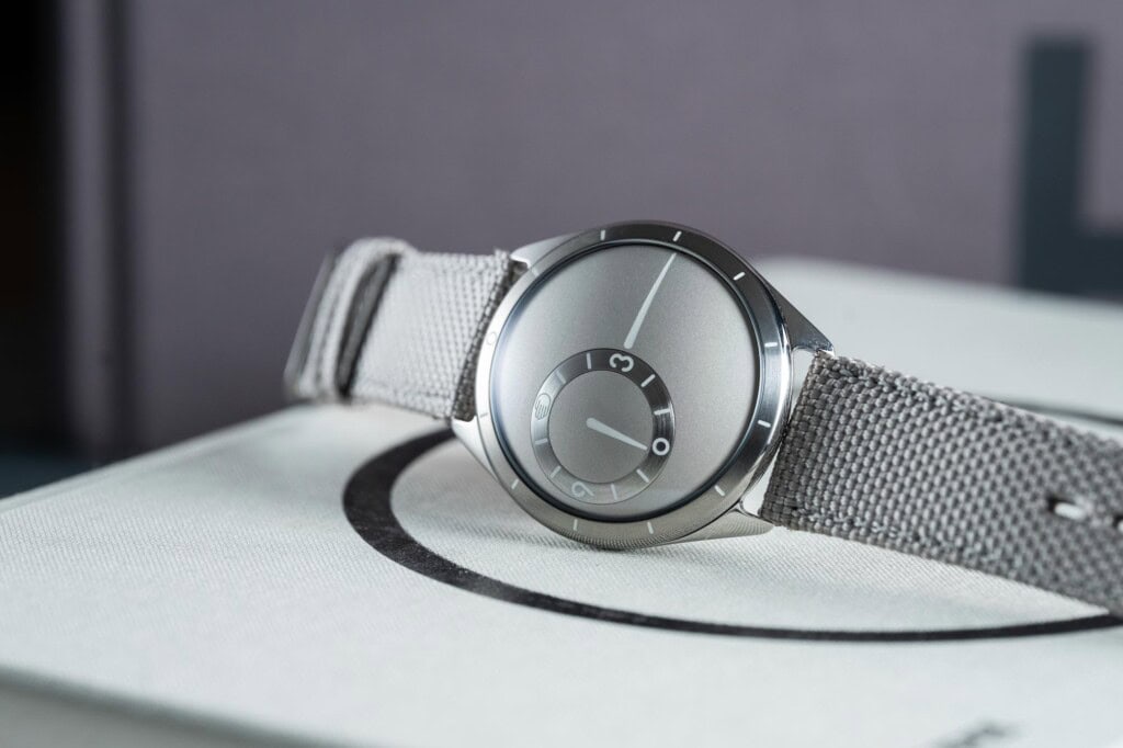
For the Type 9, the visual design of the dial is very similar to that of the Type 8, with predominantly media-blasted surfaces and a satin sheen that verges on matte. As seen on the sample, it’s a light and slightly warm gray. The satin finish is appealing, giving the surface a slight sparkle. The hour index ring is radially brushed metal that is close in tone to the titanium case. The contrast adds to overall legibility. Additionally, the index features large three and nine numerals, which are easily found at a glance. This is important as they constantly move around the dial. As with the bezel, the numerals play into an overall sportier aesthetic.
While part of the case, the marks of the bezel are utilized as the minutes index, thus playing into the dial design. As said before, the texture of the bezel provides contrast for legibility. There are small lines with rounded ends at five-minute intervals, with a circle marking 0/60. While I find the external bezel a nice aesthetic change, I wish it was fully indexed. Admittedly, it might have gotten a bit cramped or visually overwhelming, but, and perhaps this is a personal issue (ok, it is), I prefer not to estimate the minute. It’s actually a bit odd that the minimal, pensive Type 8 is fully indexed, whereas the seemingly more practical Type 9 is not. Speaking of, all of the markers, as well as the hour and minute pointers, are lume-filled and glow bright blue, clearly adding to the usefulness of the design.


