There’s a bit of dialogue toward the end of Willy Wonka and The Chocolate Factory from 1971 that goes:
Wonka: but Charlie… Don’t forget what happened to the man who suddenly got everything he wanted.
Charlie: What happened?
Wonka: He lived happily ever after.
An inversion of the typical “be careful what you wish for” sentiment that puts a rosy tint on the morbid but wonderful film, I can’t help but hear it play in my head when I look at the current state of independent watches. Once, there was a dearth of brands and originality, and now, there is almost too much. Well, not almost; there is. We went from a time when unique options were few and far between, making any that popped up all the more rare and exciting, to now, when they are almost common.
What an absurd state of affairs! Am I actually complaining about there being too much originality? Well, no, but yes (mainly for this article and humor). You see, I used to be easily seduced by these new and unique pieces, but now, I have decision paralysis. Oh, the horror!
In reality, this is remarkable. We’ve wondered for years what brands would do when the vintage craze ran its course and a need for originality returned. Rather than purely wild watches that depart from tradition entirely (though there are many), we’ve seen smaller brands invest in research, development, and craft to create watches that, at least, I would not have thought possible a handful of years ago—watches that genuinely now surpass the big brands in terms of ingenuity, especially for the price.
And, to be clear, the price has gone up, but now an ever-growing group of “micro-indies” are occupying the $3,000 – $5,000 price bracket. A long-vacant no-man’s-land that represented the gulf between micro brands, the typical roster of accessible retail brands (Seiko, Hamilton, Tissot, etc…), and the entry to the “luxury” market as well as haute-indies. Tudor eventually staked a claim, and they remain the strongest presence for a large-scale brand in the bracket. But now, it’s becoming the vanguard of haute indies, ushering in a new and exciting era.
To reflect on this current situation, I wanted to look at four watches released in the last couple of months that stood out for some remarkable reason. All are priced between $3,000 and $4,000, and while completely different in looks, all represent this new category and could present a real challenge for someone to choose between.
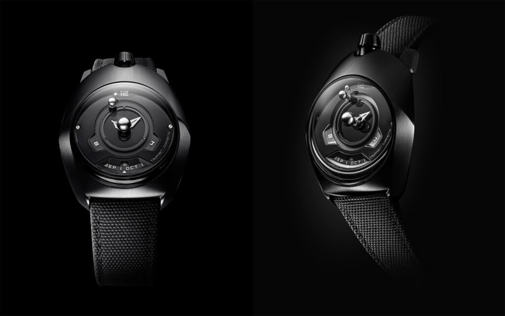
Spaceone Tellurium Black Titanium
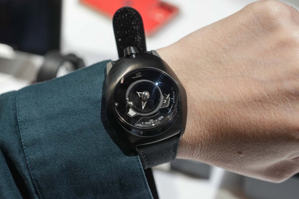
While technically revealed around Watches & Wonder of 2024, the black titanium version with an onyx dial is a newer option that was only recently announced. I’ll get back to the colorway, as it’s not really important here; rather, it’s the watch’s unique complication. We’ve written about the Tellurium before, but to refresh, in addition to the time, date, and month, it features a model of the Earth revolving around the Sun, and the Moon revolving around the Earth.
It’s not just for looks; the Earth makes one pass per year and coordinates with the month shown. The moon’s position is then accurate relative to the Earth and Sun, indicating the moon phase (when the moon is on the opposite side of the Earth from the Sun, it’s full, between them, it’s new, etc). The complication was developed by Theo Auffret, a noted young independent watchmaker who is part of the brand. Currently, it’s the only tellurium on the market.
Astronomical complications (other than moon phases) are quite rare and usually have a price tag to match. The Spaceone is about $3,200. From what I can tell, that’s at least a zero less than anything similar (which is really just Christiaan van der Klaaw).
The design is also worthy of attention, though it is far more subject to taste. Spaceone strives for a futuristic, exotic language akin to De Bethune or Urwerk. Traditional shapes are not present. Instead, the forms are swooping, aerodynamic, and sculptural. The dial feels less like a surface and more like a diorama. Nothing is ordinary, which may or may not work for everyone, but certainly qualifies as unique.
The recently dropped version, which I got to handle at Windup NYC 2024, is jet-black titanium with an onyx dial. This gives it a stripped-down, technical look that downplays the exotic shape. While I love the complication and appreciate the style, it’s not an aesthetic I seek. This version is less aggressively strange, making it more tempting. Spaceone
MING 37.02 Minimalist
MING has probably invested more in R&D over its still relatively short lifespan than most large luxury brands ever will. Admittedly, nothing says a brand has to, but it’s a driving force for MING and one that has positioned them in a unique space. From their ultra-light watch to laser etching crystals, they are always up to something that informs future designs.
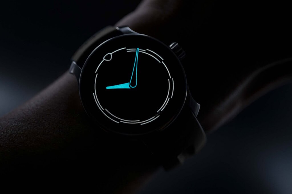
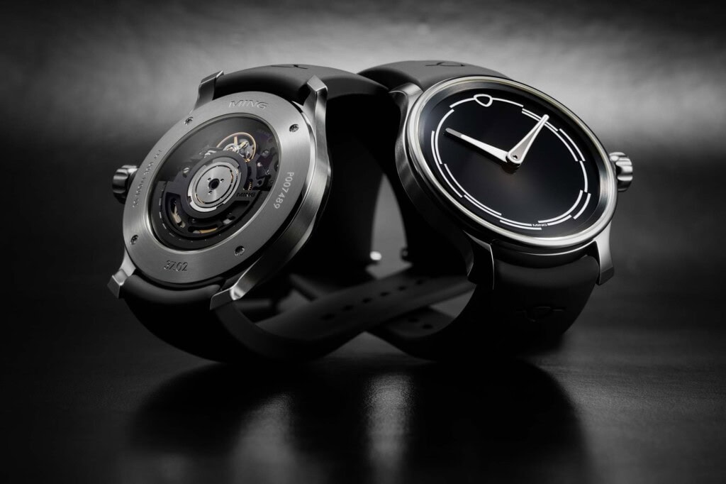
The recently launched 37.02 Minimalist is subdued by MING standards, as the name suggests. Yet, it features something unique that speaks to their philosophy: the white index glows white. It seems so obvious, yet most lume glows green or blue, and according to MING, this is one of the very few white-glowing materials in use in watches. There are white tritium tubes, but they are rarely used.
While a different color of lume might not sound as exciting as a complication, developing it took years and was eventually achieved in-house at MING’s new Swiss facility. Now, they have a proprietary material (MING Polar White) and lume color (I imagine they can’t protect the color, but other brands will have to work for it or potentially purchase it from them). In other words, they spent time and money to make one thing that is normally just accepted as is, an overlooked detail by most, more in line with their aesthetic vision. That, to me, is what a genuinely passionate brand should be doing, and to the point of this article, it’s extra cool as it’s by an indie.
As for the 37.02, well, it’s a distilled version of the MING aesthetic. It’s not their most extravagant piece, focusing on the lume and versatility. That said, it has another unique feature within MING’s catalog – it’s readily available and shipping immediately (at the moment). It’s not meant as a drop; it’s a “standard” offering. Lastly, it features a Selitta SW300 movement that has been highly customized with blacked-out, skeletonized, redesigned bridges, and rotor, making it nearly unrecognizable compared to the standard SW300 design. This is another element of extra effort that I appreciate. It’s not cheap to do that level of customization, so you don’t often see it, once again, even from larger brands.
Priced at around $3,700, the 37.02 provides a lot of unique elements at both the price point and in general. MING
De Rijke and Co. Amalfi Series
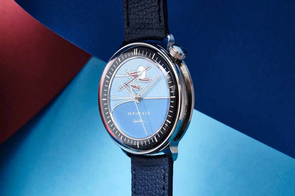
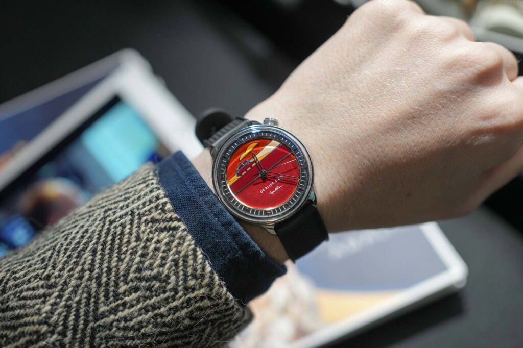
I think I’ve said it a few times on record already, but the watches I was most surprised by at Windup NYC 2024 were the De Rijke and Co. Amalfi Series – Land, Sea, and Air. A trio of champlevé enamel dial limited editions, they bring a rare “Métiers d’Art” technique into more affordable territory. But before getting to the dials, the base watch is also worth a closer look.
The De Rijke and Co. Amalfi watches were inspired by driving and have a unique case-within-a-case function that allows for the dial, which is part of the inner case, to be rotated a full 90 degrees clockwise. There is a click system in place as well, keeping the inner case positioned at different angles without needing to be screwed down (i.e., it’s not like the bezel of a Yema Superman). The idea is that the dial can be repositioned for optimal visibility while cruising in your convertible (or other vehicle of choice). With a 38.2mm diameter and 11mm thickness, it’s a novel mechanism that doesn’t bloat the watch and can actually be useful. Check out my review from 2020 of an earlier version for more thoughts.
The new series’ dials feature illustrations by Guy Allen, a British artist specializing in automotive drawings, brought to life through champlevé. A subset of enameling that requires great skill to execute, each dial is essentially a little drawing with lines made of metal. Enamel is hand-applied into the spaces created by the metal lines and fired. The result is akin to a painting but has remarkable depth thanks to the nature of enamel glass.
As this is a time-intensive process that requires a high level of craft at various points, it leads to very expensive watches. However, De Rijke found a clever workaround that helped to mitigate cost, making the watches more accessible. Typically, the outlines of the illustration would be hand etched or engraved into the metal surface before the enameling begins (a side note: the difference between champlevé and cloisonné is that the latter uses fine wires to create the outlines). De Rijke uses a fiber laser to etch the drawings in 925 silver blanks, a process handled in their workshop. The dials then go to enamelers in the UK before returning to De Rijke’s atelier for hand finishing and assembly.
Achieving this craft at a price point of about $3,600 is worthy of mention on its own, but it’s only as good as the watch’s appeal. This is where seeing them in person comes into play; they are gorgeous. I didn’t expect to be enamored with them as champlevé or cloisonné dials are not something I’ve typically been attracted to, let alone illustrations of methods of transport. Yet, I was completely taken with them the second I strapped one on. The combination of the art and the clever-yet-wearable case made them exactly what I hope to find in a watch at this price – something entirely different. De Rijke & Co.
Alterum Worldtimer
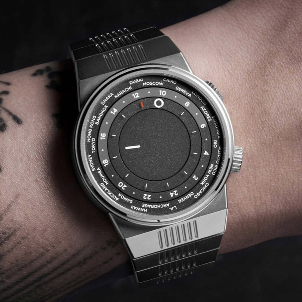
The final watch of this selection is perhaps the most “normal” because it doesn’t specifically have a new or rare feature. However, it has a strong and modern aesthetic perspective that stands out. The design of the Alterum Worldtimer is rooted in architectural influences, such as Frank Lloyd Wright’s Guggenheim Museum in Manhattan. While not a unique source of inspiration, the interpretation stands out.
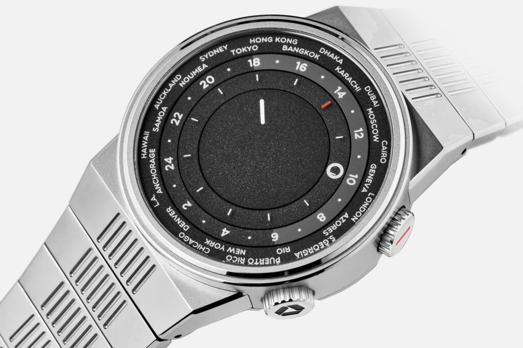
Rather than a typical 3-hand watch with vaguely architectural lines or elements directly transported from some facade, the Alterum appears as a structure. The case features rigid geometric shapes colliding together that when paired with a reductivist philosophy, create a form that is a touch brutal, a dash minimal, a hint odd, and a smidge challenging. An integrated bracelet with single flat links adorned with a grill pattern brings an urban edge into play. In fact, the whole watch speaks to a dystopic futurism similar to the Ripley and other Giugiaro designs.
It’s one thing to create a distinctive case and another to make a dial that reflects the same vision. For the Alterum, “clarity over complexity” was a driving force, which is clear in the construction and layout of the dial. In fact, there is no surface to speak of, or rather, there are no hands, just surfaces, and they are always in motion. Minutes are read on the center disk via a line, followed by hours read by a circle, and then 24-hour time, coordinated with the final ring, an internal bezel with cities for 24 timezones. It’s worth noting that the surfaces are flush.
The typography is clean, utilizing sans-serif typefaces with easily readable forms. As a final touch, the hour marks are printed on the back of the sapphire crystal, thus the hour ring never blocks the marks. Actually, nothing ever crosses, guaranteeing visibility. The surfaces are all dark, asphalt gray treated with a slight texture that makes them matte at certain angles and slightly sparkled at others.
Buildings and other structures appear as monolithic forms, but in reality, they are systems. The exterior takes the spotlight, but the actual functionality of the space depends on the various and highly complex working within. The analogy to watches is obvious, yet while the movements of the Alterum are not on display, the dynamic dial, which shifts throughout the day, speaks to this concept in a way that relates well to the theme.
Powered by a Selitta SW330-2, the Alterum Worldtimer measures 38.5mm in diameter, and 10.5mm thick. The first version, as seen here, was priced at about $3,200 and limited to 100 pieces, which appear to have sold out. Luckily, the designer and brand owner, Justin Walters, also of Marin Instruments, has said more versions are to come. Alterum
Concluding Thoughts
The watches mentioned here are only a small swath of this growing segment, including watches by Arcanaut, Christopher Ward, Louis Erard, Atelier Wen, and others. As someone who has been in the industry for over a decade, I find this to be the most exciting development in sometime. It’s a price point that allows smaller independent brands to be more experimental while demanding creativity. As a consumer, it’s a price point that doesn’t create immediate disappointment upon seeing it. Rather, when a watch is $3 – $5k I think, maybe not at this moment, but I can make that happen. Call it, realistically aspirational.
The post Realistically Aspirational: Four New Watches in the “Micro-Indie” Space appeared first on Worn & Wound.

