When Christopher Ward announced the C60 Trident Lumière a few weeks back, the emphasis—errr—the spotlight was put on using massive Globolight lume plots on the dial. Twelve individually molded lume-infused ceramic monoliths promised to glow like cartoon uranium studded the dial per hour. A dial they claimed cost them 4x the usual. Well, after a few weeks with the watch, while I can attest that the lume is very impressive, it’s not why the C60 Trident Lumière is successful.
Rather, it’s simply because it’s the best-executed tool/sports watch the brand has made, at least that I’ve encountered. The proportions are refined, the finishing is excellent, and the aesthetic is cohesive. The C60 Trident Lumière (just Lumière from here out), like the Twelve X and Bel Canto, demonstrates that Christopher Ward is a brand operating at a level on par with or higher than big Swiss brands at an equivalent price, a function of, but not a given, with their D2C model.
However, it’s perhaps more impressive in some respects than those other two watches because it’s not a showpiece. No, the Lumière is a mainline, if higher priced, offering for the brand. Which is to say, it’s a sign of what they can do on a “normal” watch and, thus, perhaps, a sign of what to expect in the future. But, enough hyperbole. Clearly, I am a bit taken with the Lumière, so let’s get into the details.
Review: Christopher Ward’s Best Diver Ever? The C60 Trident Lumière
Grade 2 Titanium
Chronometer Certified SW300-1
Matte Gray Fumé
Globolight
Sapphire
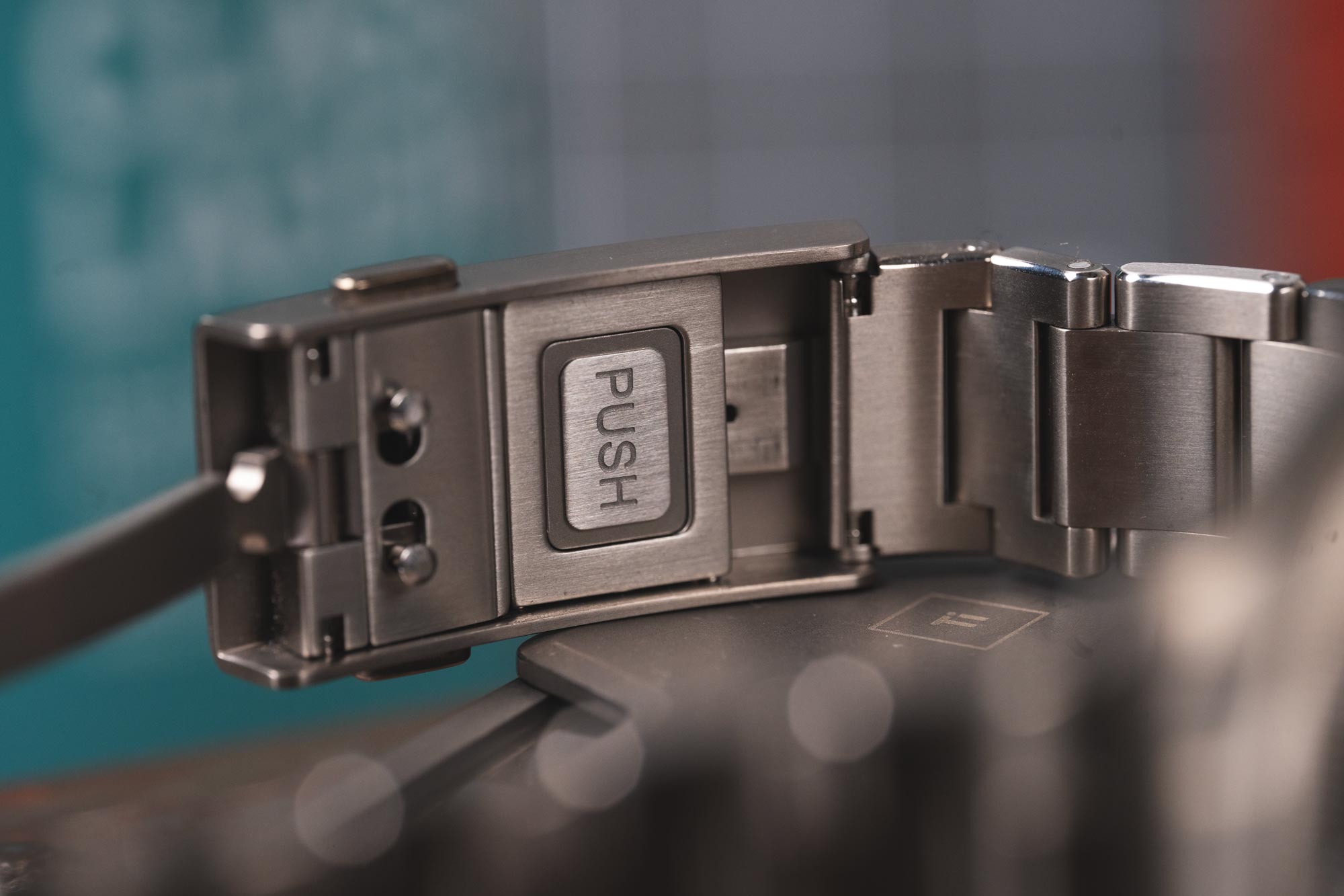
Titanium Bracelet
300
41 x 47.9mm
10.85mm
22mm
Screw-Sown
60-Month
$2390
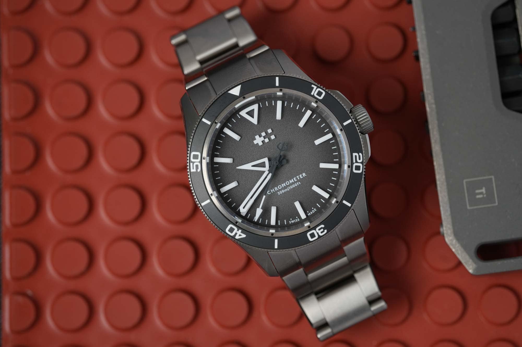
Case
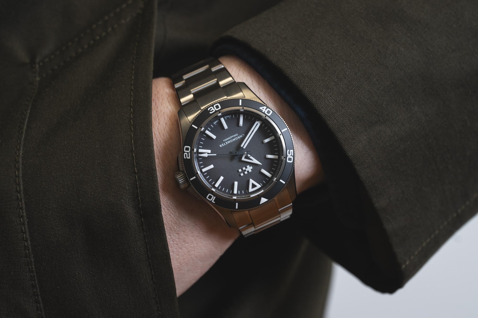
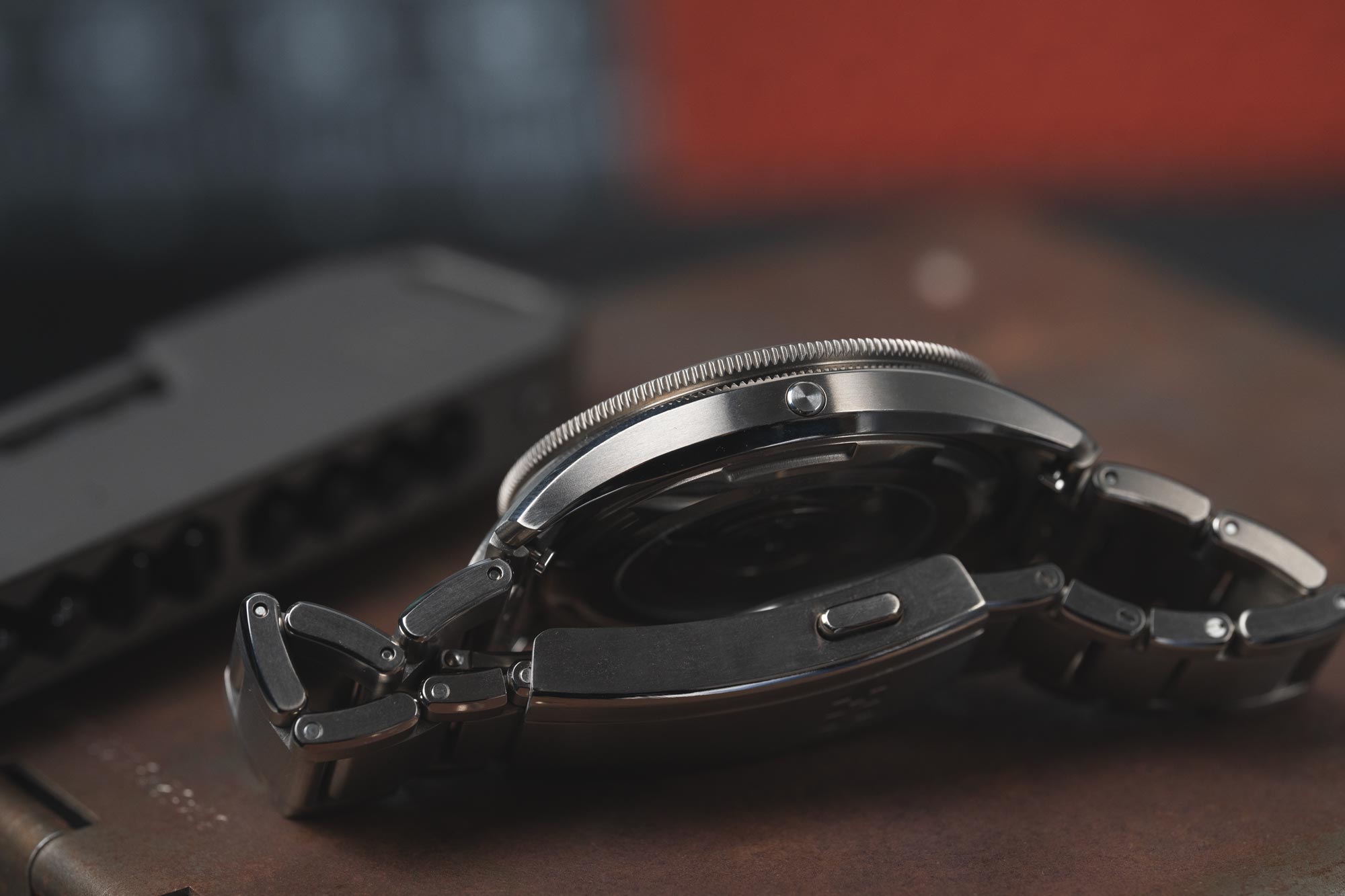
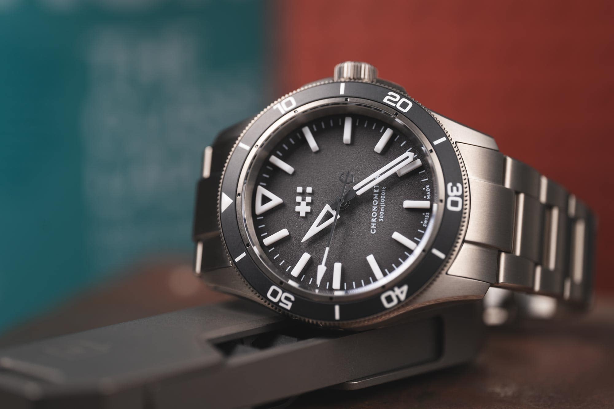
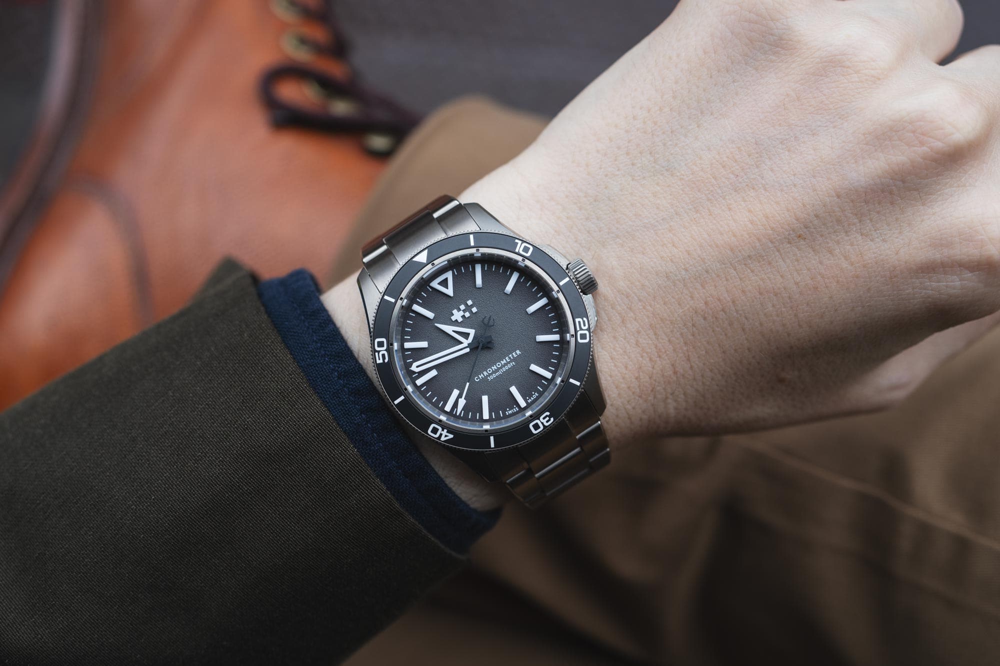
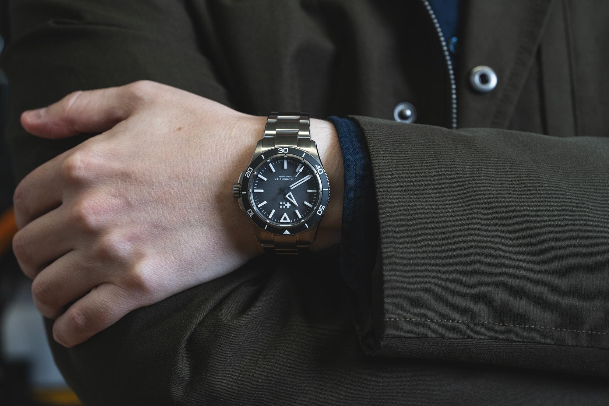
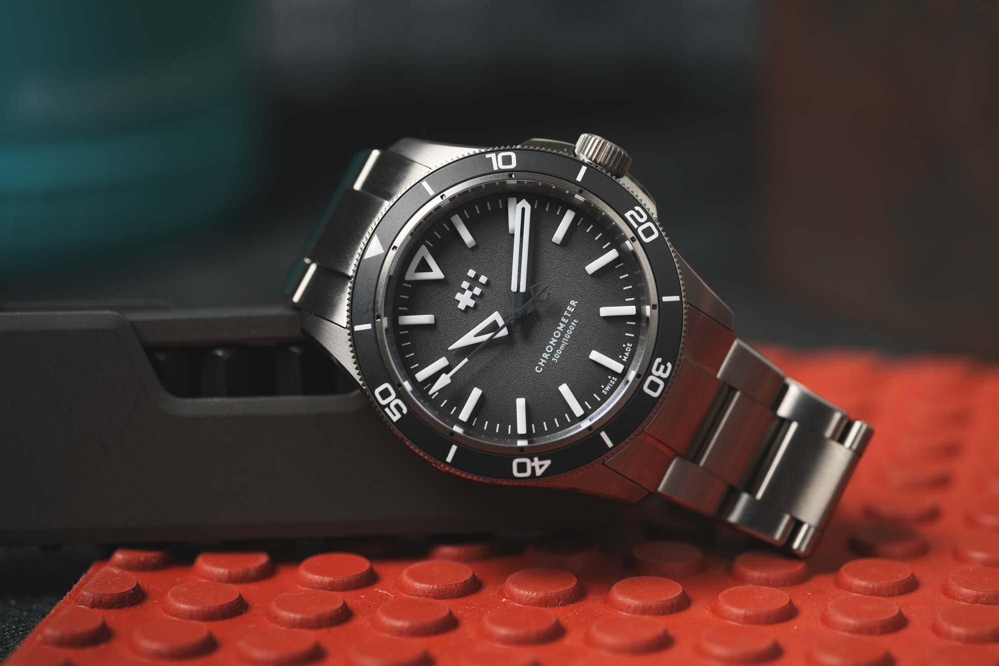
Immediately upon removing the Lumière from its packaging, I was struck by the case. Measuring 41 x 47.9 x 10.85mm, it read impressively thin. 41mm, which almost feels daring in today’s small-diameter climate, is wide enough to spread the 10.85mm out, creating a proportionally thin watch, especially for a 300m diver with a substantial bezel. Wide, swooping bevels on both the top and bottom of the mid-case further reduce the thickness visually.
The finishing also stood out. Made of grade 2 titanium, which some brands will tell you can’t be polished nicely, the Lumière is mostly brushed with an appealing, noticeable grain but also features crisp polished bevels with sharp lines. Finishing quality can be a bit hard to quantify, especially as it has improved industry-wide over the last few years. Still, based on my experience, I’d say the Lumière is punching well above its weight.
The crown guards are an interesting and appealing detail. Previous watches from the C60 line feature crown guards that are part of the mid-case itself, protruding from the side in a continuous line. The Lumière’s are small blocks on either side of the crown that appear to be bolted on with small hex screws. If this looks familiar, that’s because it’s how they do them on the Twelves.
From an aesthetic perspective, they feel more technical and aggressive than the previous design, which works well for the modern diver format. They also feel slightly more involved and detailed, which adds to an overall sense of quality. On a broader conceptual note, it’s interesting to see how Christopher Ward’s aesthetic is evolving, with one line learning from another.
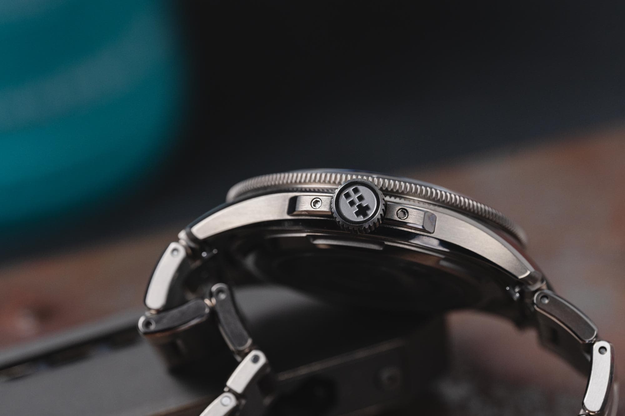
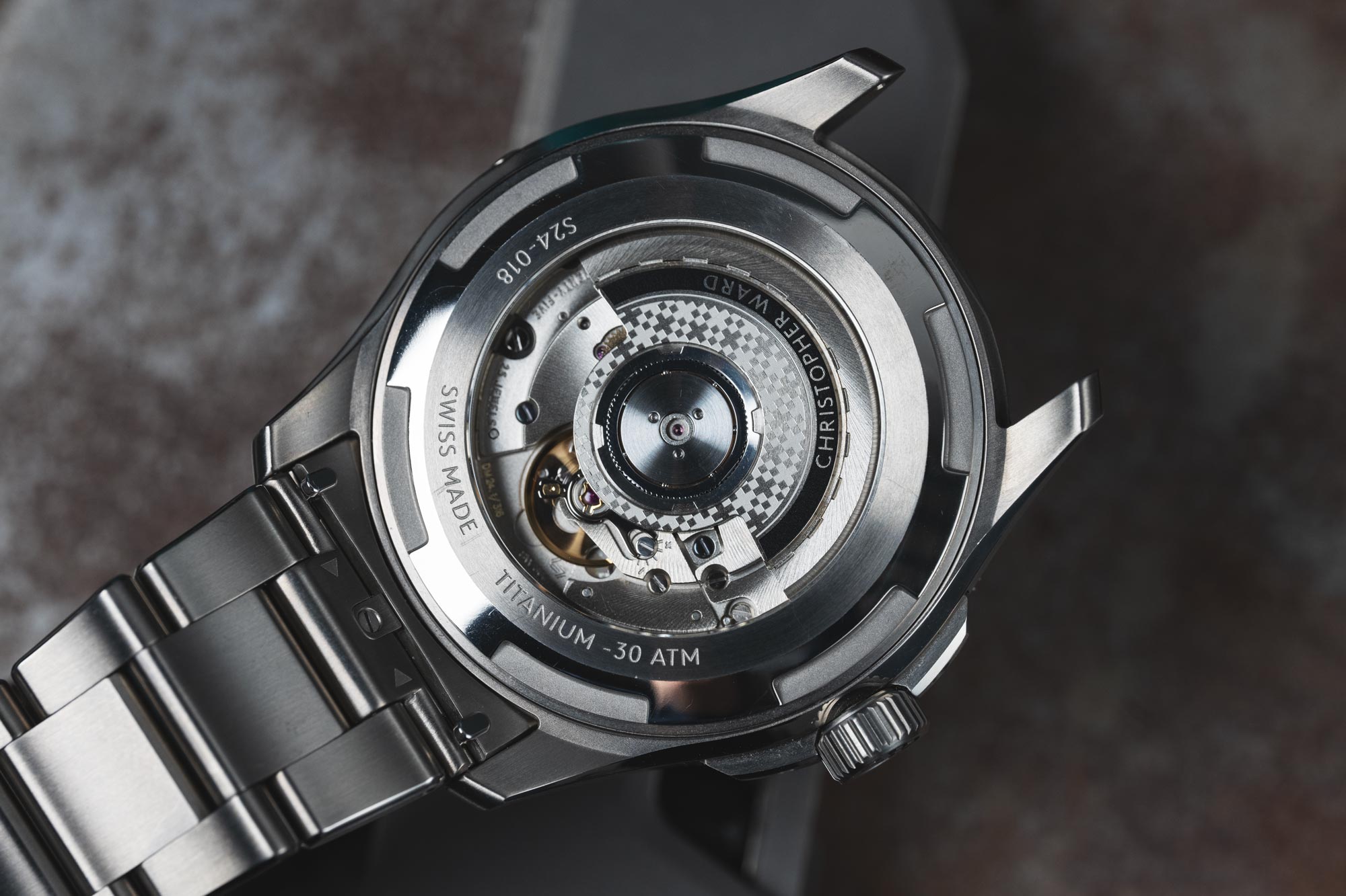
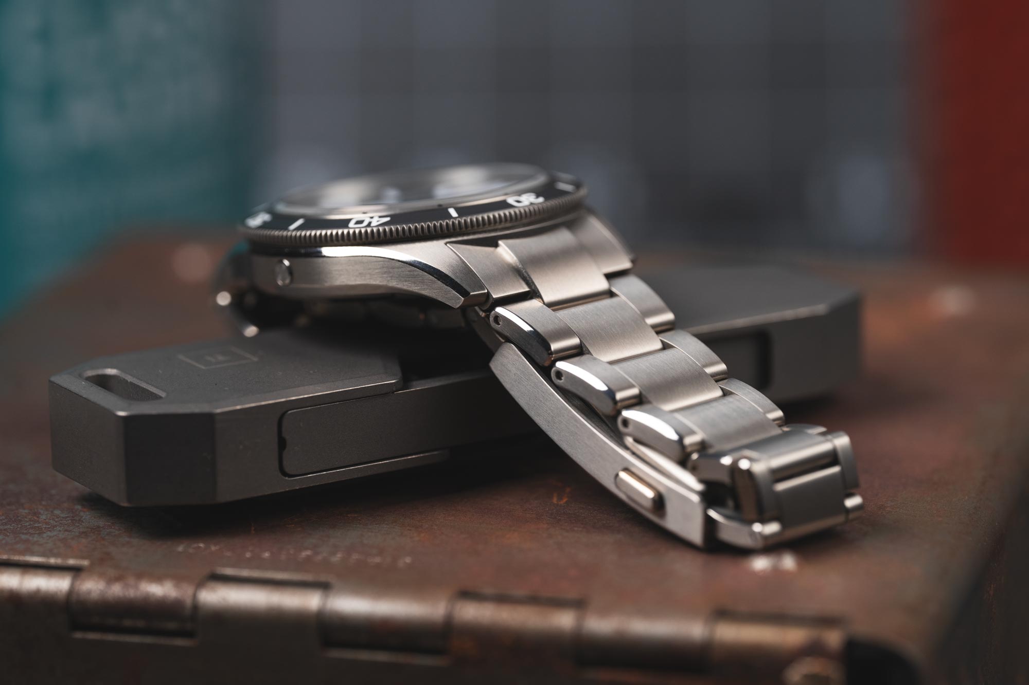
There are a couple of other points of interest: on the left side, you’ll find a helium escape valve, which is like the hood scoop or spoiler on my Subaru Legacy GT from college—it may look cool (or not), but it is really of no use (see this recent and informative post by Submersible Wrist for more information). Also, the case back features a large display window allowing for a view of the SW300 inside. Though a chronometer-certified movement with a custom rotor, it’s not much to look at as it doesn’t feature any extra graining or decoration. So, I don’t think a display back was necessary here, though it does make the water resistance and slim profile even more impressive. That said, I do wonder if they had gone solid if they could have made the watch even thinner.
The Lumière features a 120-click uni-directional bezel with a coin edge for grip. The mechanism feels excellent. It has a proper amount of tension and lands precisely with only the tiniest bit of backplay. It’s also possibly the loudest bezel I have experienced. Its sound is more like a “pop” than a “click” and rings out. Like, enough that I got a bit self-conscious while playing with it in the office. But, hey, if that’s your thing, C Ward nailed it.
Dial and Bezel Insert
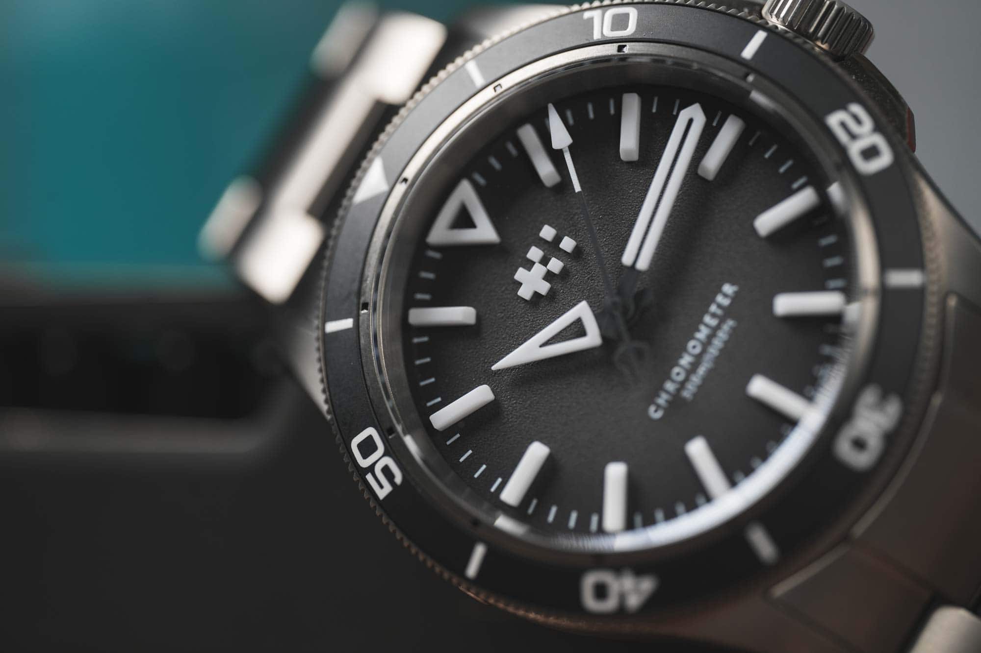
As mentioned before, the dial and its use of GlobolightTM were the focus of the press materials for the Lumière. A material/process by a Swiss company called Xenoprint that brands have used for a while, such as Sinn, Aera, Moser, and Christopher Ward on the Moon Glow; they turned it up to 11 for the Lumière. There are 17 pieces on the dial, 12 for the hour markers and 5 for the logo, with the hour pieces being almost absurdly tall, so tall that they practically touch the minute hand.
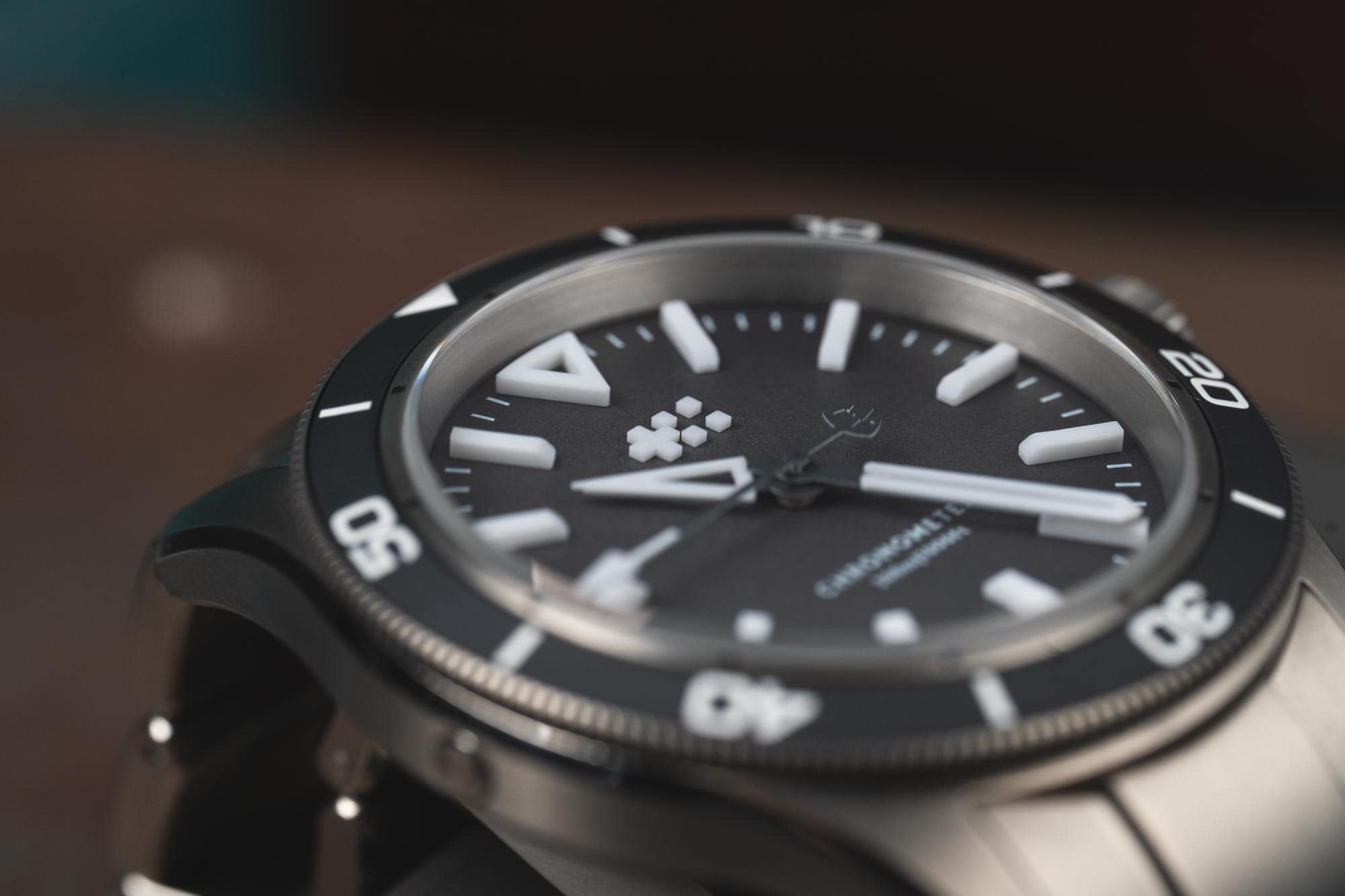
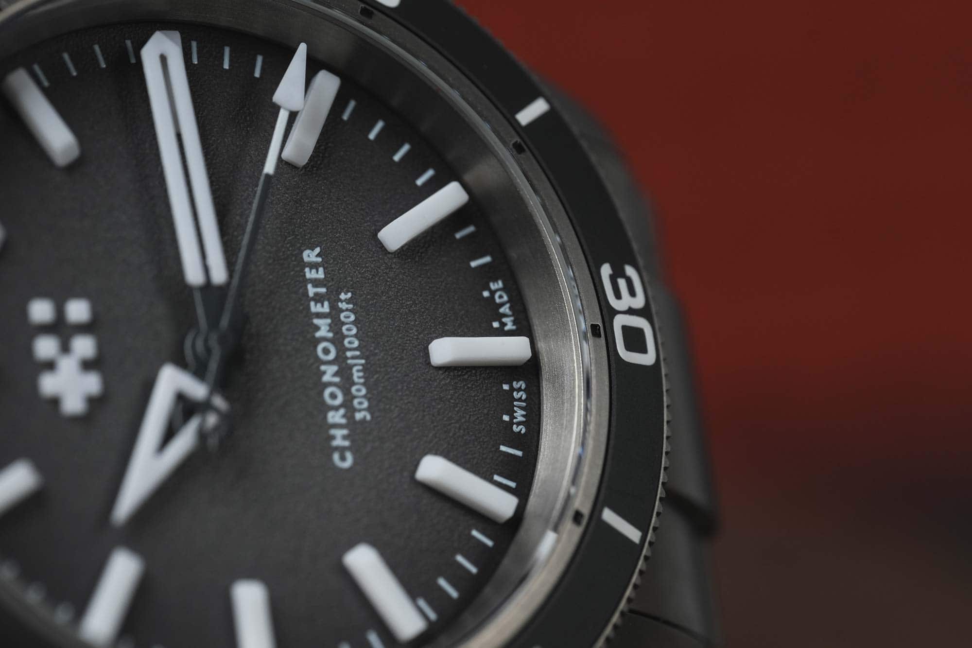
Every hour save 12 is a long rectangle with a chamfered edge towards the center of the dial, adding just a bit of nuance to their otherwise blocky forms. The marker at 12 is an oversized triangle outline, an enjoyable change from standard shapes. As it’s a molded form, there is an inner cavity that shows off that it glows not just on the top but all sides, including within, which is a smart touch. The outline form is echoed by the hour and minute hands, which are inverted versions of the typical C60 shapes, featuring thick stacks of lume.
And, as expected, they glow damn well. When charged directly, everything glows bright blue and lasts a good while. I went to an afternoon movie while wearing the Lumière, and going from the sunny world to a dark theater was a great test. At first, it was bright enough to look like it was powered from within. It faded slowly, but with eyes adjusted to the dark, the marks and hands were visible for some time.
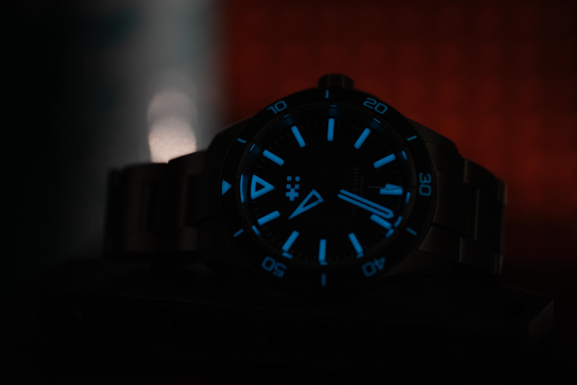
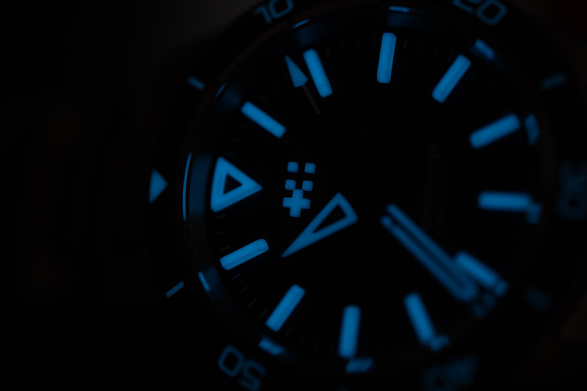
However, one of the best features of the markers is not related to their lume. Because they are so tall, and such a crisp white, they are highly visible from all angles. The Lumière is a watch that is nearly as functional when seen from a very low angle as directly from above. The fact that that stays true while glowing makes it even better. While viewing angle is not a requisite for a dive watch, as far as I know, it seems advantageous.
The dial surface is a dark gray gradient with a stippled texture. The gray-to-black fade is effective, emphasizing the markers and adding some stylization. The stamped textured surface was perhaps chosen to appear extra matte, once again emphasizing the crisp white markers. I find this type of texture a mixed bag. Sometimes, it works better than others, as it can come off a bit cheap. Here, I think it’s inoffensive and has intention, but because of the stamping, the white overprint, particularly on the dial text, has slightly messy edges. Admittedly, this is only noticeable with a macro lens.
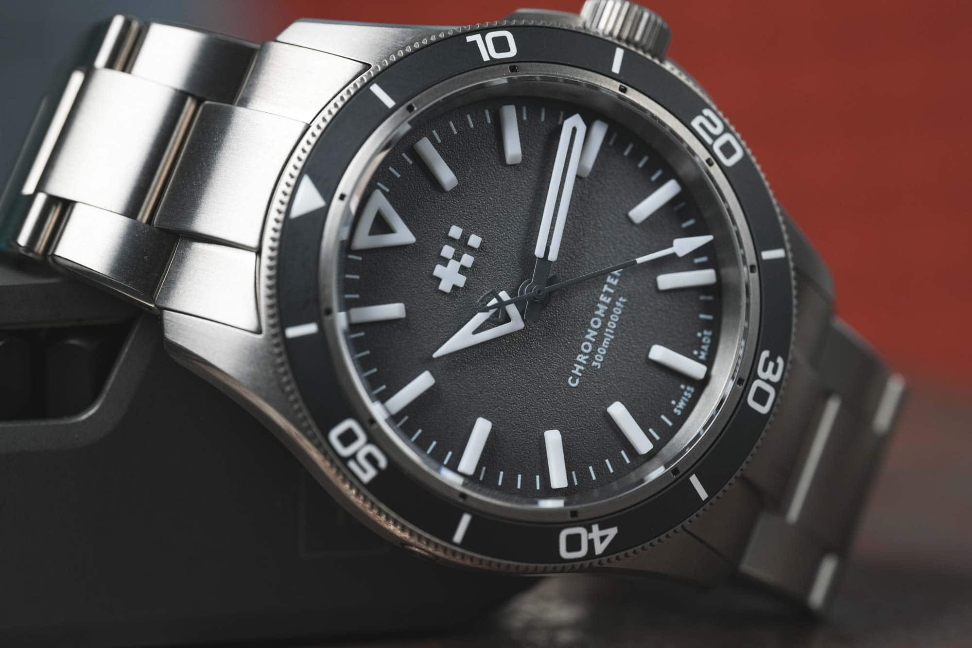
The grey extends to the matte ceramic bezel insert, which looks fantastic. Sure, an all-black dial and bezel would have looked good, too, but the use of gray here plays off of the titanium nicely, giving the Lumière a touch more of an aesthetized look. The markings on the bezel are all lumed, as they should be on a modern diver, matching the color of the dial markers but not quite their intensity.
A functional detail I was glad to see was that the ring on the inside of the bezel, which features small black marks every five minutes, was stationary. This allows you to align the bezel with these marks rather than the dial, which is easier as they are on the same level. I recall previous C60s featuring split bezel designs that were cool looking but were part of the same surface, so they didn’t have this added function.
The dial of the Lumière comes together well, and I’d go so far as to say I prefer it to the standard C60s, which are similar but feature applied metal markers. To me, the C60 line has always been about satisfying the itch for a clean, simple, modern diver. They aren’t overly stylized, which in turn means they can seem a bit plain– but intentionally so. And that’s not a problem; they are more about purpose and versatility.
The Lumière has a technical and aggressive style, making it feel more modern. But, despite having a touch of an edge, it’s still easy to digest. There are neither design elements that blow my mind nor disappoint. It’s balanced, it’s clean, it’s legible. The Globolight certainly pulls it all together, but as I said, most of the time, it isn’t doing anything that tall, white plastic markers might not have achieved on their own. Overall, the dial is straightforward and lacks any fussiness, which I appreciate.

